6 different styles
We provide lovingly crafted style variations to give you a glimpse of what is possible with this theme. The built-in theme customizer allows you to modify colors, fonts, sizes and much more without any CSS knowledge. Just choose your colors with the color picker and adjust the theme with only a few clicks. Click on one of the images to see the style.
Block Appearance
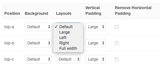
This theme provides a number of settings for each module position. You can apply different background colors and vertical paddings and remove horizontal padding. Each block can have a default, large or full width layout and can be aligned to the left or right.

Custom Widgets
Edge provides three custom Widgetkit 2 plugins to match the theme – the Slideshow Panel, Slider and Slideshow.
[widgetkit id=”20″ name=”Theme Grid Widgetkit”]
Navbar Layouts
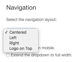
Edge theme features four different layouts for the main navigation. The menu can be centered and aligned to the left or right. Additionally, it can be centered with the logo above the menu. You can apply a sticky navbar on desktops and on mobile devices, so it will remain fixed at the top of the window when scrolling. Another option extends the dropdown to the width of the entire browser window.

Article Layout
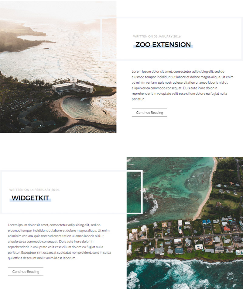
Edge theme comes with an optional blog layout. You can now decide whether your image will be positioned to the left or to the right of your content. The title and meta data of the article are enhanced with a border that slightly overlaps the image.

Text Highlight
To set apart headings or other text elements, add the .tm-text-highlight class to a <span> element. Add the .tm-text-highlight-contrast class, so it will work on dark backgrounds.
<h1><span class="tm-text-highlight">...</span></h1>
Since 1978
Image Border
As a little visual extra, Edge features the .tm-image-border class. Adding it to a container element with an image inside, will apply an offset border that matches the panel box styling.
<div class="tm-image-border"><img src=""/></div>

Title Border
You can apply the same border style from the blog layout to any other heading. Just add the .tm-title-border class to a container element. We also provide responsive alignment classes, e.g. .tm-title-border-small-left to overlap image and heading inside a grid until they stack.

    <div class="tm-title-border tm-title-border-medium-left">
        <h1>...</h1>
    </div>
| Class | Description |
|---|---|
.tm-title-border |
Add this class to a <div> element to create the border around your title. |
.tm-title-border-left |
Add this class to create an offset to the right. |
.tm-title-border-right |
Add this class to create an offset to the left. |
.tm-title-border-small-left |
The offset to the right only affects device widths of 480px and higher. |
.tm-title-border-small-right |
The offset to the left only affects device widths of 480px and higher. |
.tm-title-border-medium-left |
The offset to the right only affects device widths of 768px and higher. |
.tm-title-border-medium-right |
The offset to the left only affects device widths of 768px and higher. |
.tm-title-border-large-left |
The offset to the right only affects device widths of 960px and higher. |
.tm-title-border-large-right |
The offset to the left only affects device widths of 960px and higher. |
More Custom Classes
| Class | Description |
|---|---|
.tm-graphic |
Add this class in the General section of your widget to display a rectangular on top of the image as a graphic element. |
.tm-text-uppercase |
This class will transform your text to capital letters. |
.tm-margin-xlarge,.tm-margin-xlarge-top,.tm-margin-xlarge-bottom |
Add 80px top and/or bottom margin to elements. |